Article
Control Charts
Create control charts easily and conveniently
QSuite lets you create different types of charts for your analyses. Each chart can be configured to meet your needs.
Introduction
Control charts let you monitor the behavior of a process to determine whether it is performing in a controlled state. A control chart identifies two types of variation:
- Common cause variation: this is the expected variation of the process and occurs when data stays within calculated control limits.
- Special or assignable cause variation: this variation indicates that the process is being affected by one or more external variables. This type of variation is a signal that action must be taken on the process.
QSuite supports two groups of control charts:
- Charts for continuous data: this group includes the Individuals and Moving Range (X-MR), Averages and Ranges (X-R), and Averages and Standard Deviation (X-S) charts. These charts are used when plotting data where a decimal point makes sense (temperature, revenue, costs, time, etc.)
- Charts for count data: this group includes the Defectives charts (P and NP) and Defects charts (C and U). These charts are used when plotting data where a decimal point does not make sense (e.g. number of people, number of nonconforming units, number of defects, number of accidents, etc.)
Creating a new chart from the menu bar
To create a control chart from the menu bar, follow these steps:
- Click on "Quality Control"
- Hover over "Control Charts"
- Select the control chart you want to create from the dropdown list
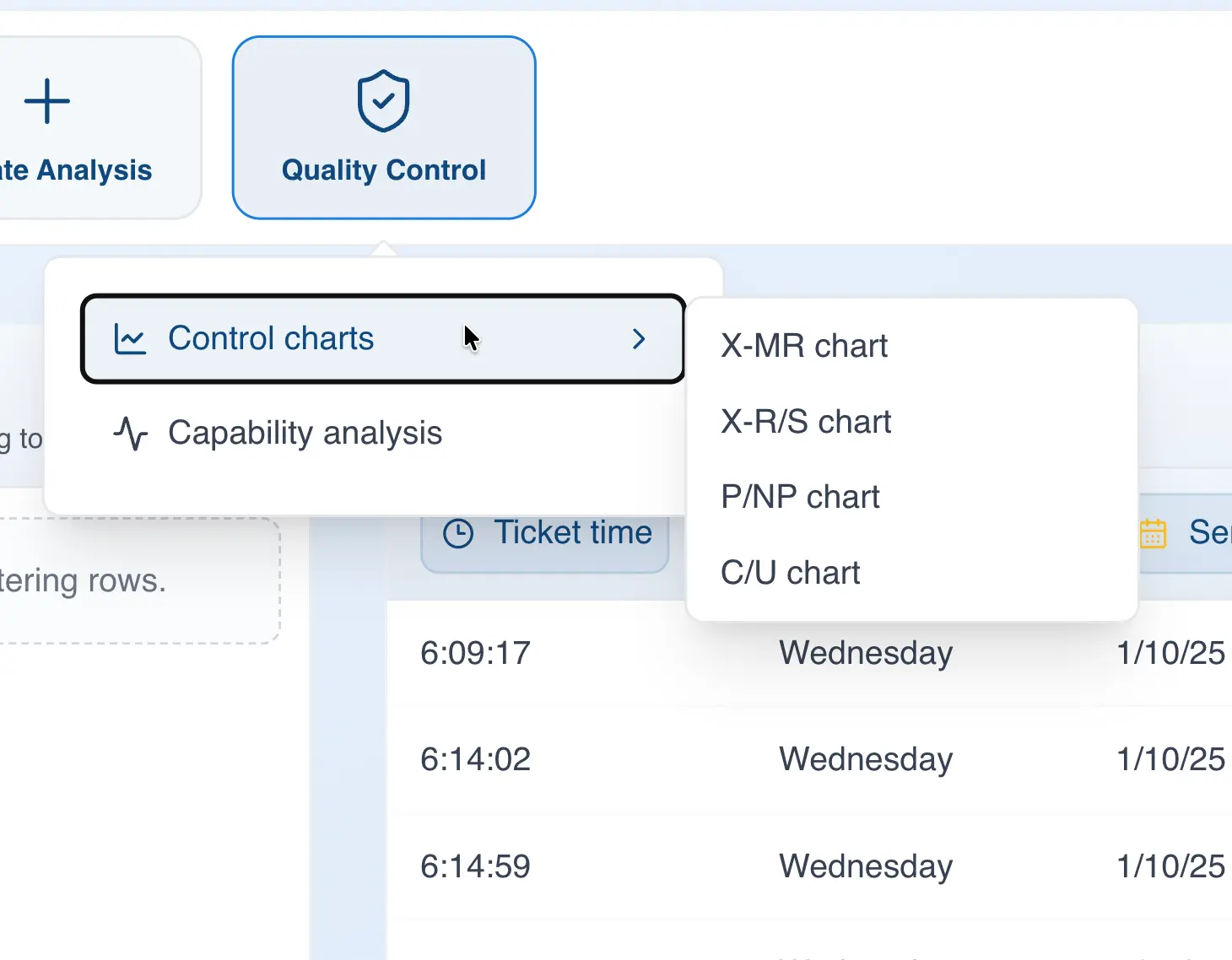
- In the "Values" section, drag the column you want to analyze
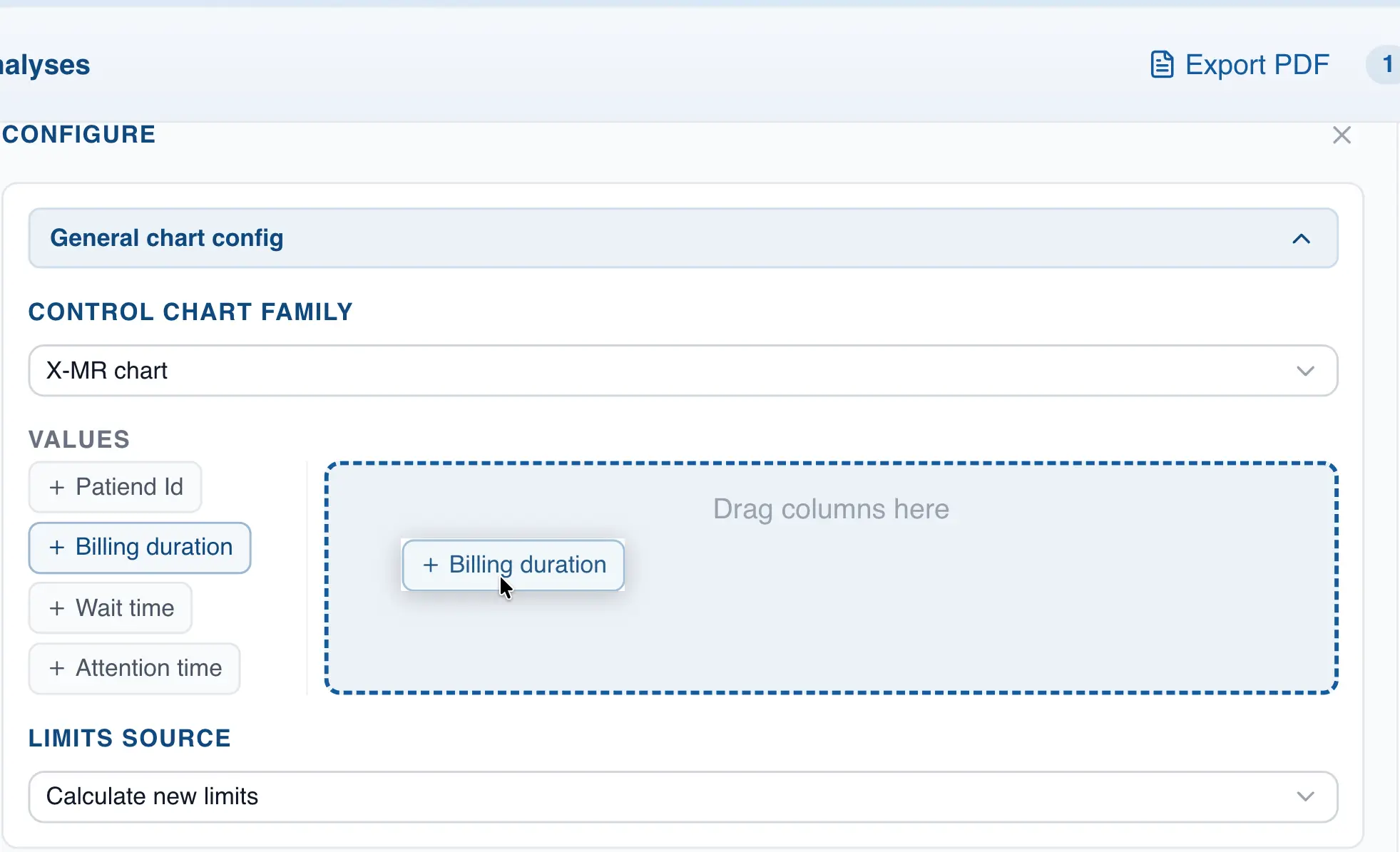
- Except for the Individuals chart (XmR), you will also need to specify the subgroup size. Go to the "Specifying the subgroup size" section for more information.
Creating a new chart using drag and drop
- Drag the column you want to analyze to the analysis panel
- Drop the column on the control chart type you want to build
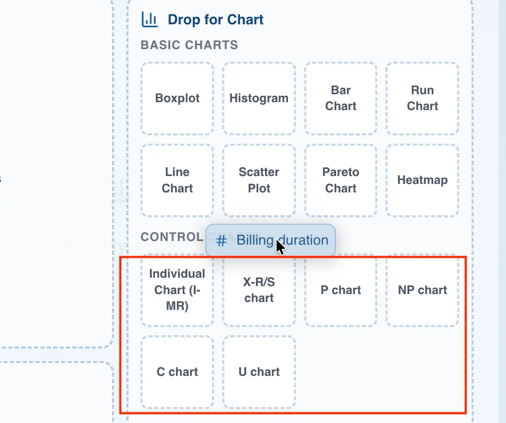
- If you are not building an Individuals chart, specify the subgroup size to generate the chart. Go to the next section for more information on how to do this.
Specifying the subgroup size
When building a control chart other than the Individuals and Moving Range (X-MR) chart, you will need to specify the subgroup size. QSuite gives you two ways to do this:
- Specifying a fixed subgroup size. With this option you simply enter a number and QSuite automatically builds the subgroups. For example, if you set the subgroup size to 5, QSuite will form one subgroup for every 5 observations.
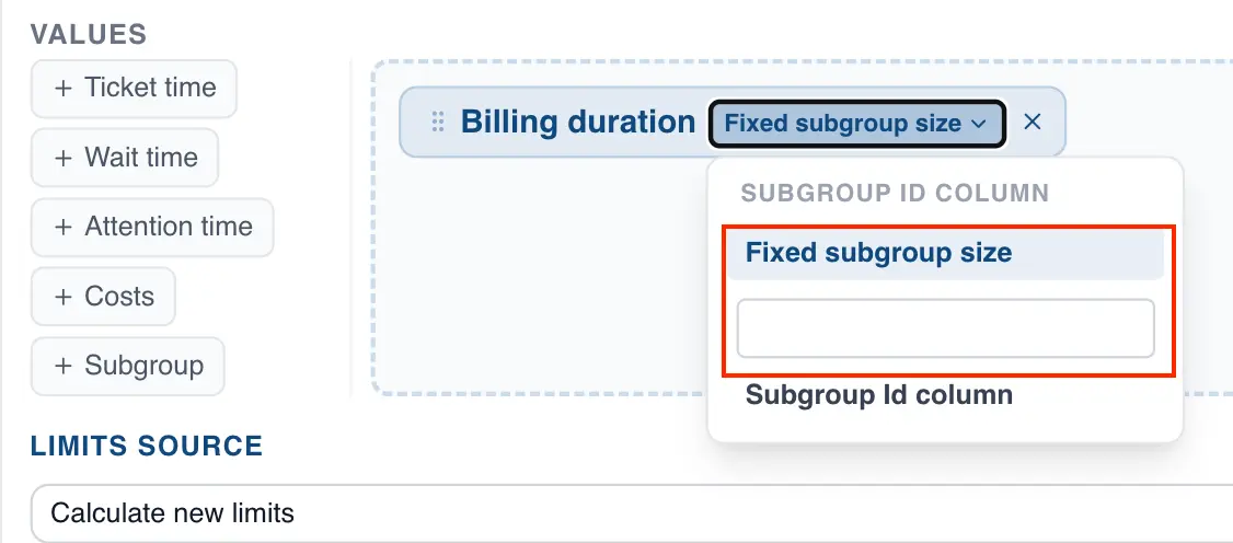
- Specifying a subgroup column. This option is useful when you have already formed the subgroups and have a column that identifies which subgroup each observation belongs to.
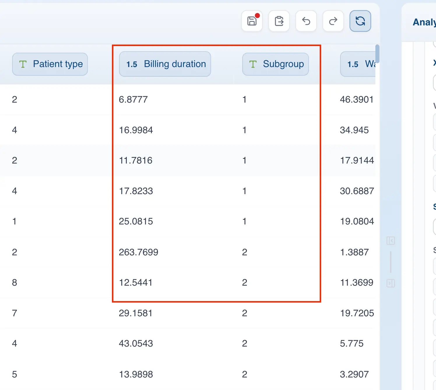
For example, the following image shows a dataset with a column identifying the subgroup each observation belongs to.
To specify this column when building the chart, follow these steps:
- Go to the selected column label and click where it says "Subgroup"
- Click the dropdown to select the "Subgroup ID column" option
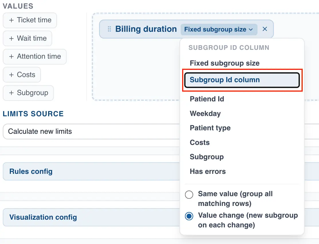
- Select the grouping method. QSuite supports two methods:
- Same value: this method groups all rows that share the same subgroup identifier, regardless of their order. For example, with this method QSuite will recognize that the following table contains only two subgroups (subgroup 1 and 2):
| Subgroup ID | Nonconforming Count |
|---|---|
| 1 | 10 |
| 2 | 15 |
| 2 | 13 |
| 1 | 13 |
- Value change: this option creates a new subgroup each time QSuite detects a change in value. For example, in the following table QSuite will form three subgroups (subgroups 1, 2, 1):
| Subgroup ID | Nonconforming Count |
|---|---|
| 1 | 10 |
| 2 | 15 |
| 2 | 13 |
| 1 | 13 |
Using categorical data to build a control chart
All control charts must be built using numeric data (integers, decimals) rather than categorical data (text, labels). However, QSuite lets you use categorical data columns with certain control charts. This is useful when you have a column specifying whether each observation is conforming or nonconforming.
For example, imagine you have the following dataset:
| Sample ID | Conforming? |
|---|---|
| 1 | Yes |
| 2 | No |
| 3 | No |
| n | ... |
In traditional software, you would first need to summarize the number of nonconforming units for each subgroup and then use that information to create the chart. That is, you would first need to produce something like this:
| Subgroup No. | Nonconforming Count | Subgroup Size |
|---|---|---|
| 1 | 20 | 100 |
| 2 | 17 | 100 |
| 3 | 21 | 100 |
| n | ... | ... |
With QSuite, you can use the "nonconforming" column directly and let the application summarize the data for you, choosing how you want to display it (e.g. as a count or percentage).
The charts that support this feature in QSuite are the Individuals (XmR), P, and NP charts.
Creating an Individuals chart using categorical data
- Drag a categorical column to the right-hand box
- Select a grouping variable (such as a date column)
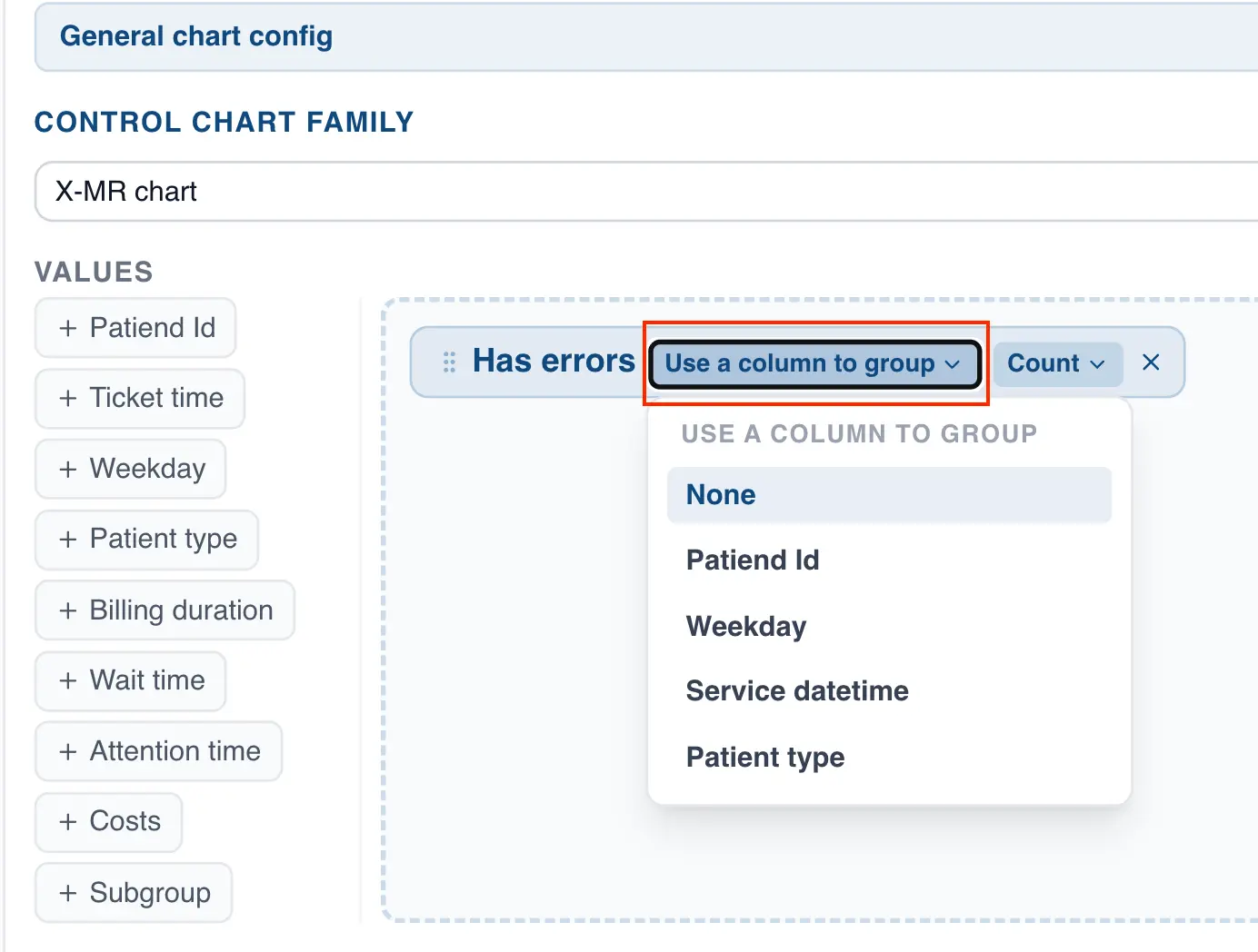
- Choose how you want to display the data. QSuite defaults to count, but you can switch to percentage.
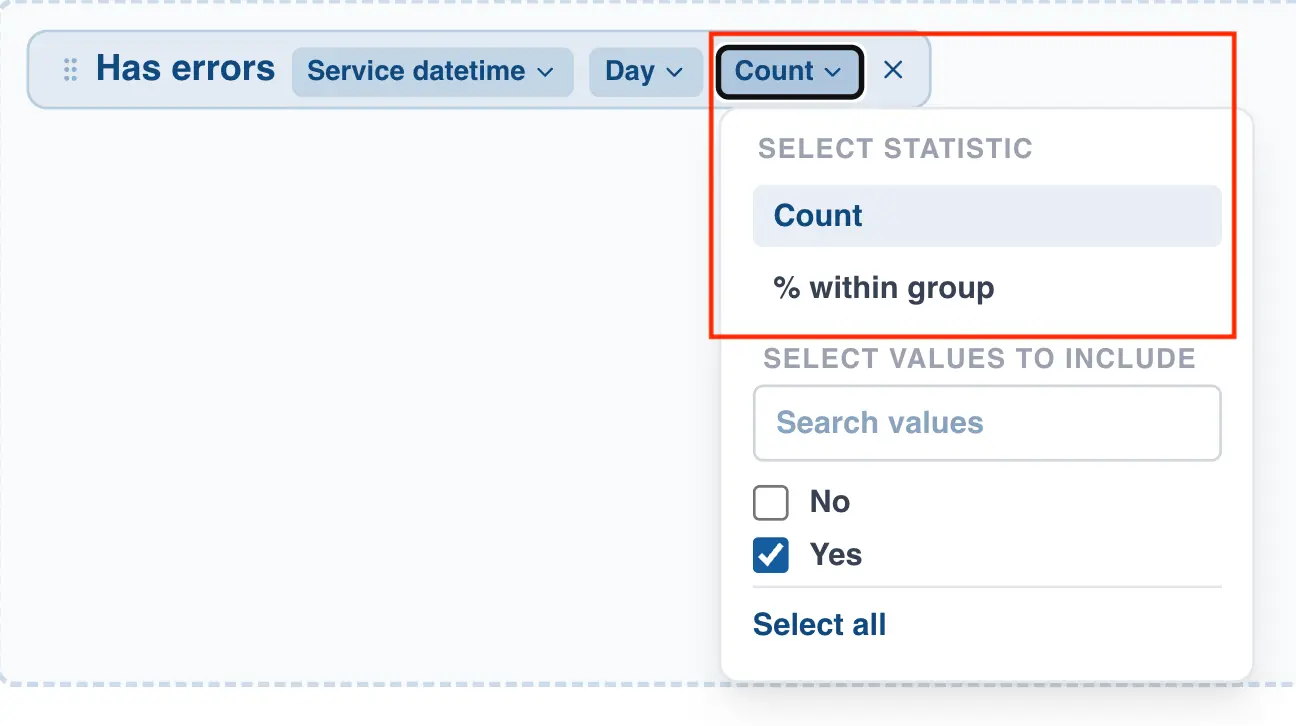
- Select the values from the column you want to chart.
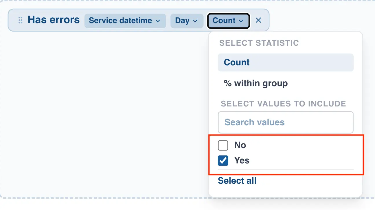
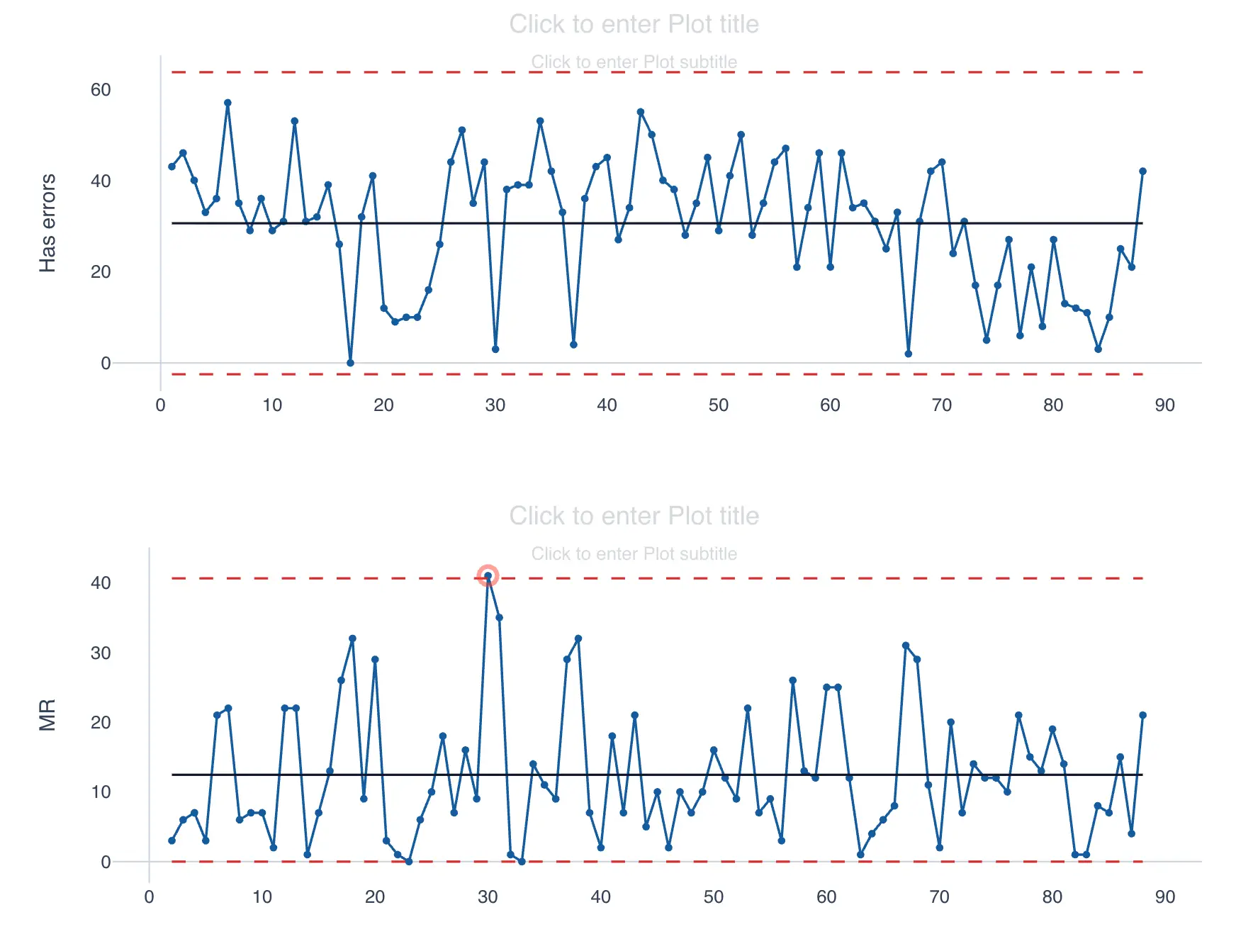
After completing these steps, the Individuals chart will display the count or percentage of observations, based on your selection.
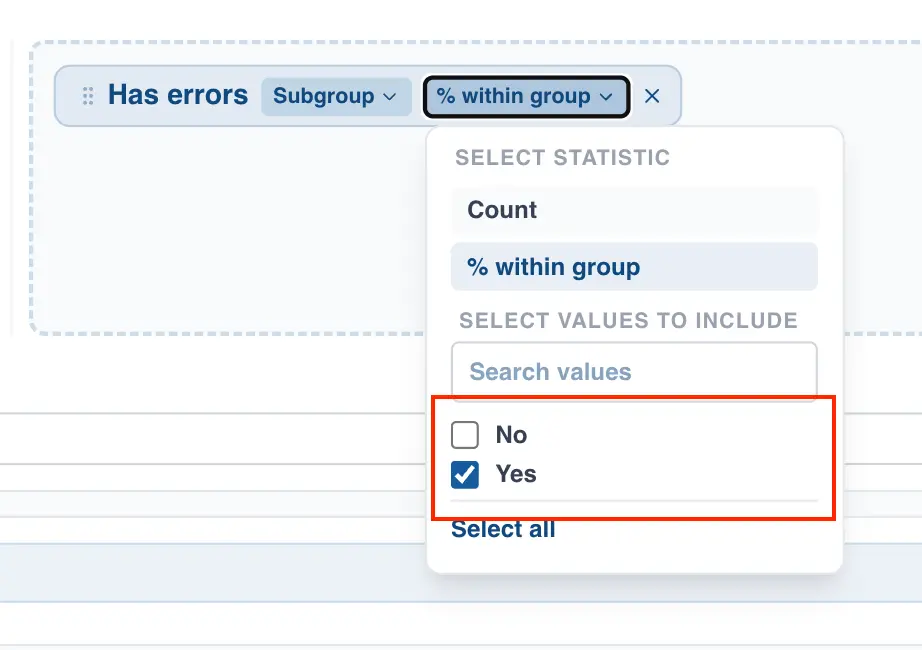
Creating a P/NP chart using categorical data
- Drag a categorical column to the right-hand box
- Select the method for forming subgroups. You can choose between defining a fixed subgroup size or specifying a column that identifies which subgroup each observation belongs to.
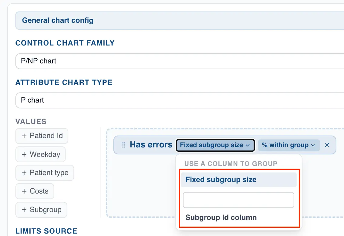
- Choose how you want to display the data. QSuite defaults to count, but you can switch to percentage.
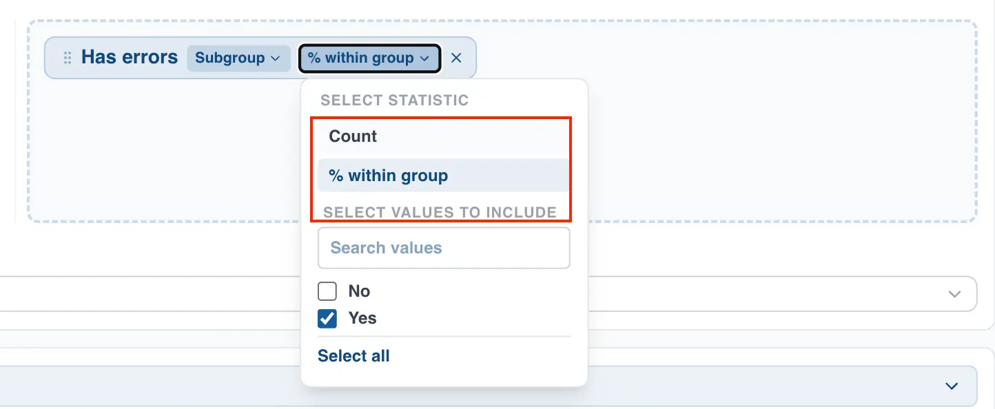
- Select the values from the column you want to chart.
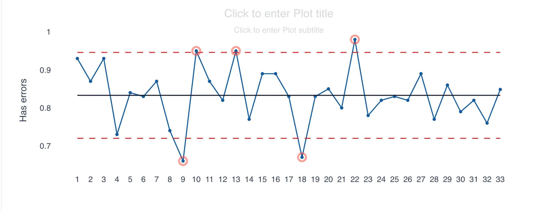
After following these steps, you will get the P/NP chart for the selected categorical column:
Interpreting a Control Chart
Configuring the control chart interpretation rules
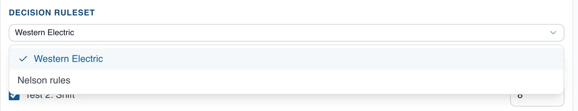
Several rules exist for interpreting patterns in control charts. QSuite supports two rule sets: the Western Electric rules and the Nelson rules.
The Western Electric set has 4 rules while the Nelson set has 8 rules. QSuite uses the Western Electric rule set by default.
To change the rule set, follow these steps:
- If it is not already open, open the chart configuration panel by clicking the gear icon

- Go to the "Rules Configuration" section. You can enable or disable individual rules by clicking their checkbox. You can also modify the number of consecutive points required to trigger each rule.
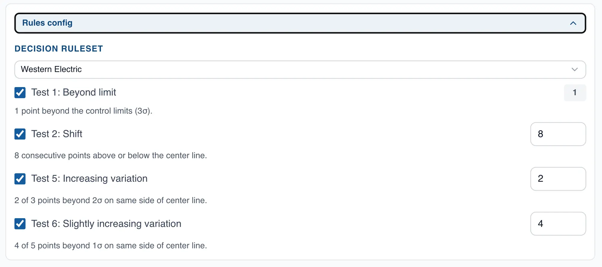
- To change the rule set, click the dropdown and select the Nelson set.
Displaying control chart zones
By default QSuite builds the control chart with limits at +/- 3 sigma. You also have the option to display limits at +/- 1 sigma and +/- 2 sigma, which divides the chart into zones.
To display the zones, follow these steps:
- If it is not already open, open the chart configuration panel by clicking the gear icon
- In the "Display Settings" section, check the "Show control zones" option
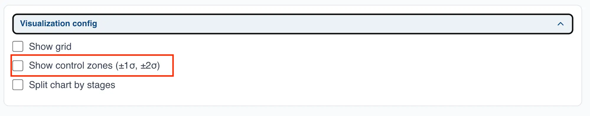
When you enable this option, the chart will display the 1, 2, and 3 sigma limits as shown in the following image:
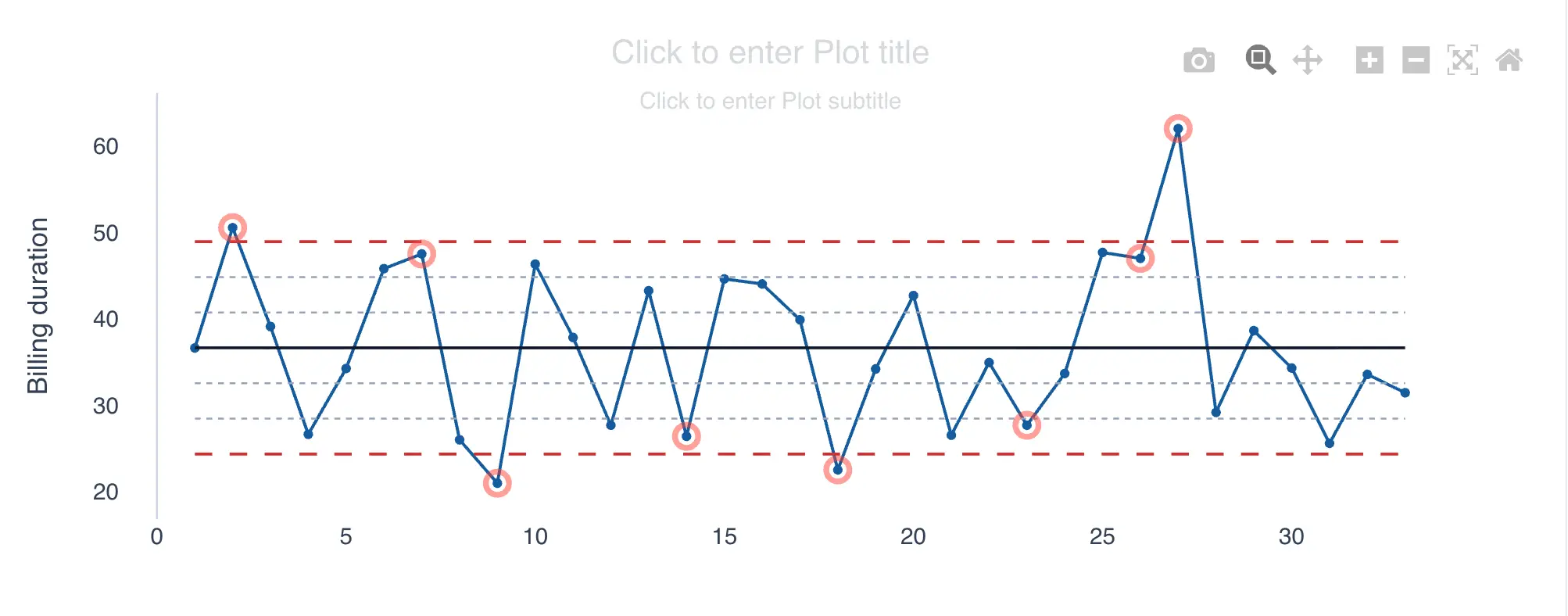
Interpreting the control chart
QSuite automatically marks with a red circle every point that violates one of the rules covered in the previous section, as shown in the following image.
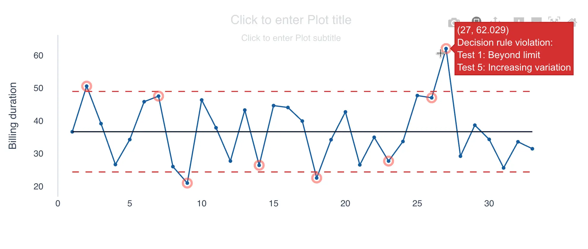
Hovering over a red-marked point will display a tooltip showing which rules were triggered.
When a rule violation is identified, the cause of this behavior should be investigated and corrective actions taken.
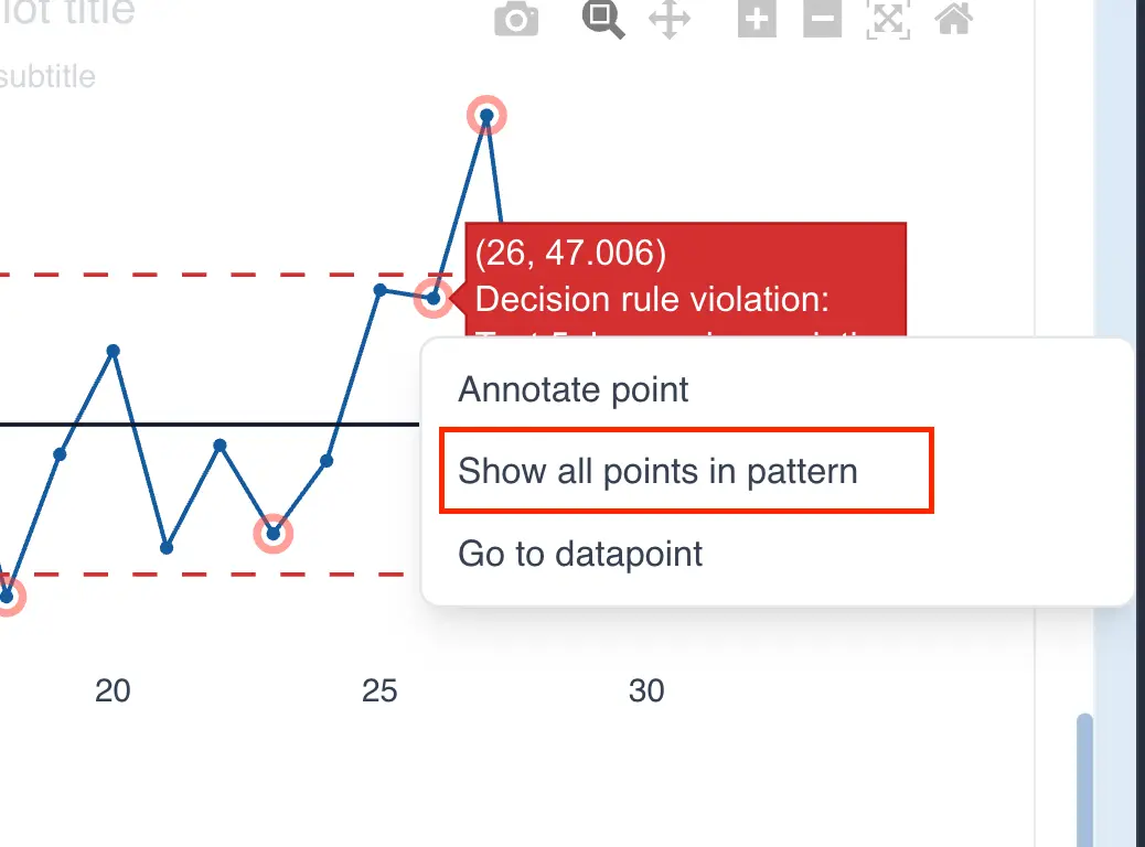
QSuite also gives you the option to display all the points that formed the pattern. This is useful during a root cause investigation, since the problem may have started several observations before the pattern was completed.
To display all the points that form the pattern, follow these steps:
- Click on the point marked in red
- From the menu that appears, click "Show all pattern points"
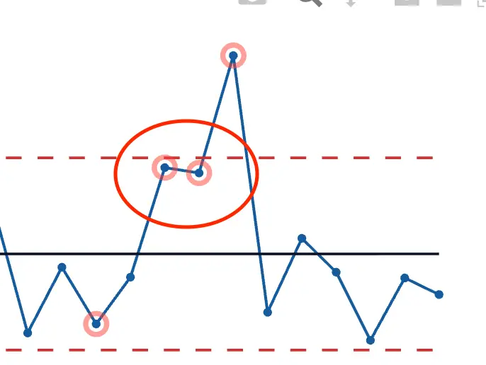
After clicking, QSuite will highlight in red all the points that are part of the pattern that triggered the rule. The following two images show an example of this.
- By default, only the last point that completed the pattern is shown
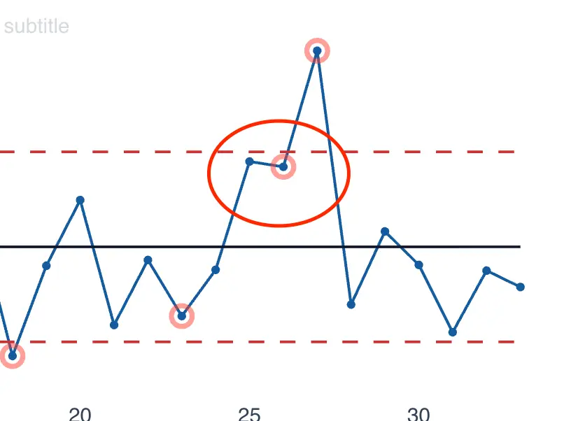
- With the option enabled, all points in the pattern are shown
Navigating to the source data point
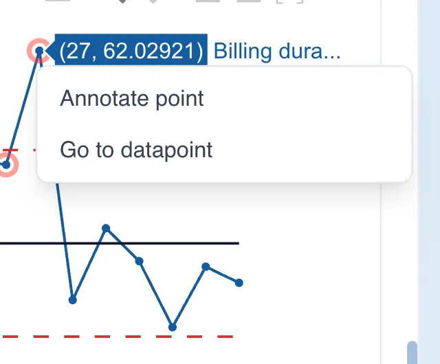
In some situations you will need to look up contextual information related to a point on the control chart that is stored in another column of the worksheet. QSuite lets you navigate easily from the control chart to the cell where that point is located. To do so, follow these steps:
- Click on the control chart point you want to look up
- Click "Go to data point"
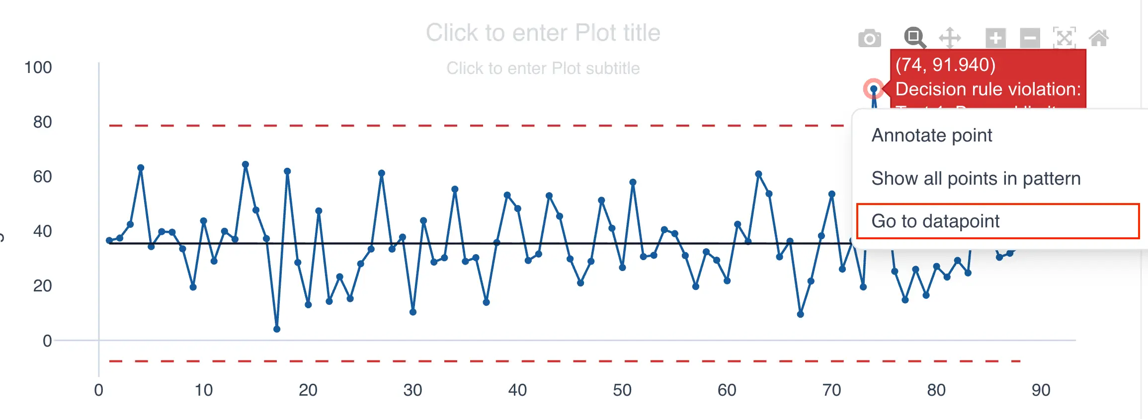
QSuite will automatically highlight the worksheet cell where the point you selected is located.
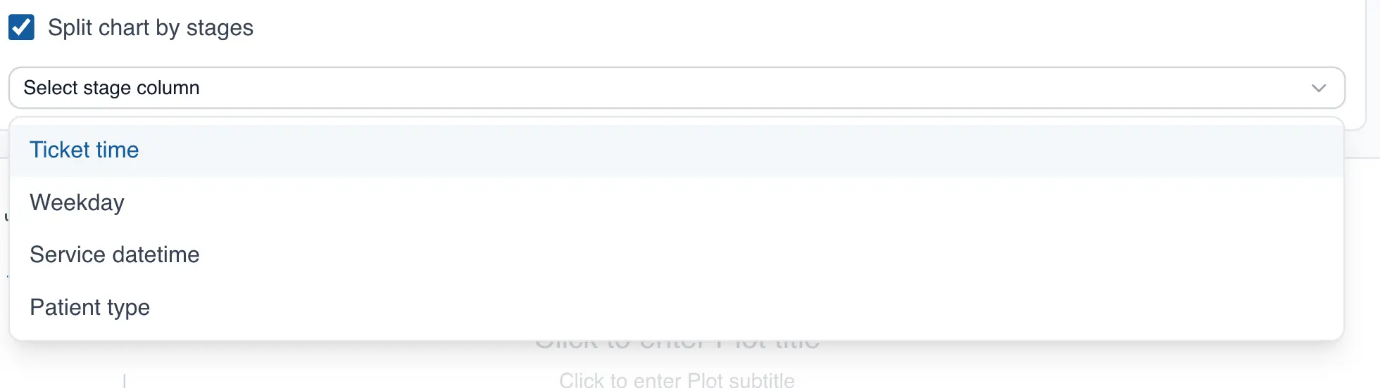
Stage analysis of control charts
QSuite lets you perform a segmented analysis of control charts, known as a stage or phase analysis.
Stage analysis consists of segmenting the data using the values of a categorical column (e.g. machine, location, person, request type, etc.). To perform a stage analysis, follow these steps:
- If it is not already open, open the chart configuration panel by clicking the gear icon
- Go to the "Display Settings" section and enable the "Split chart by stages" checkbox
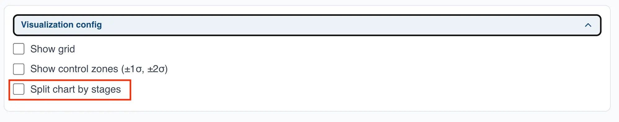
- From the dropdown, select the column you want to use to segment the control chart
After selecting the column, your control chart will be displayed separately for each category in that column. The following example shows a control chart split by day of the week.
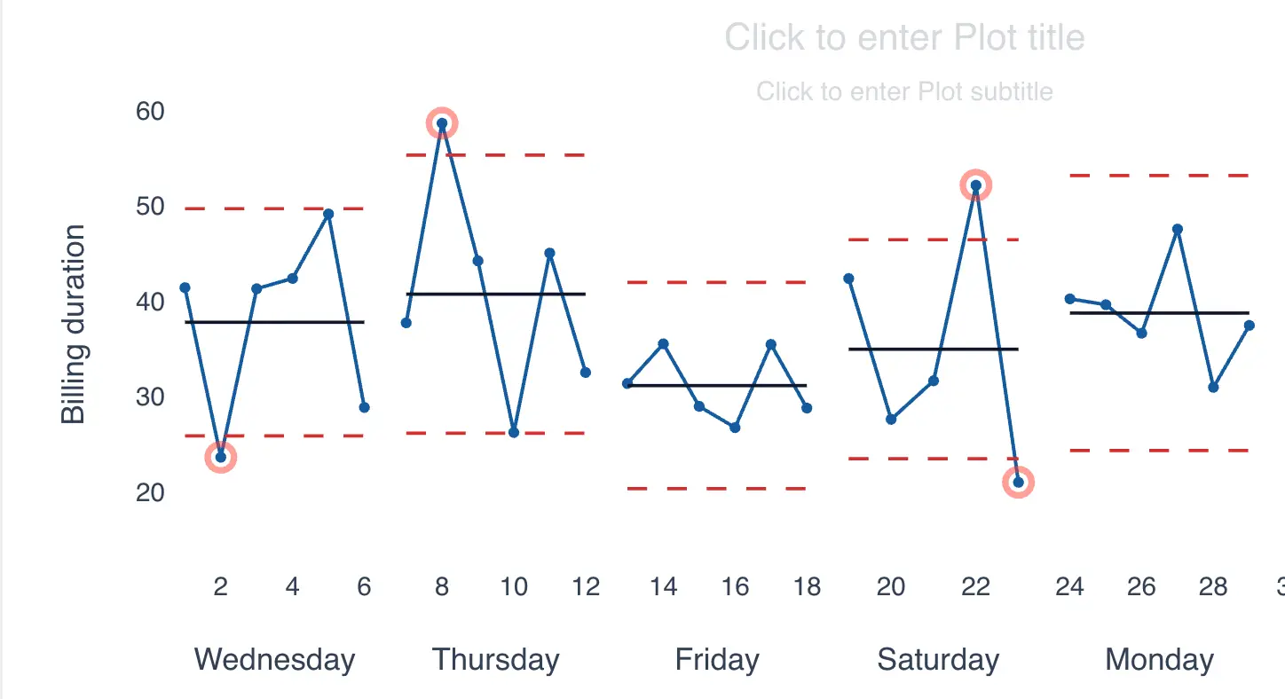
Notice how easy it is to identify differences in process performance across days of the week. For example, Friday has the narrowest limits and the lowest mean compared to the other days.
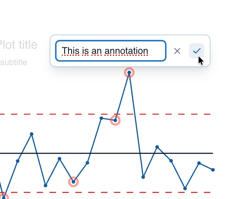
Annotating control chart points
QSuite lets you annotate any point on the control chart easily. To do so, follow these steps:
- Click on the data point you want to annotate
- From the menu that appears, click "Annotate point"
- Enter your text and click the checkmark to save the changes
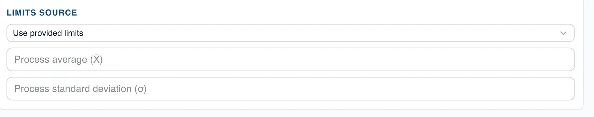
Setting Control Limits
Obtaining the process mean and standard deviation
When you build a control chart, QSuite displays a summary box with the process statistics. This box appears just below the chart:
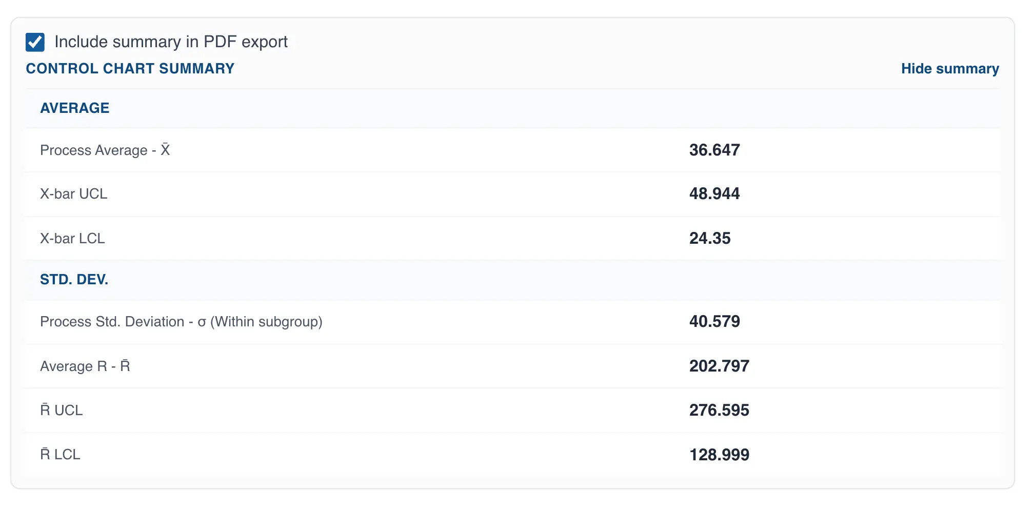
The summary shows both the process mean and its standard deviation. This information is required when you want to build a control chart with previously established limits.
Setting the control chart limits
Control limits should only be recalculated when a permanent change has occurred in the process. Otherwise, the limits should be fixed, as they serve as the reference baseline against which the process is compared over time.
By default, QSuite calculates the limits automatically each time you build a control chart. When you need to fix them, follow these steps:
- If it is not already open, open the chart configuration panel by clicking the gear icon
- Go to the "Limits Source" section
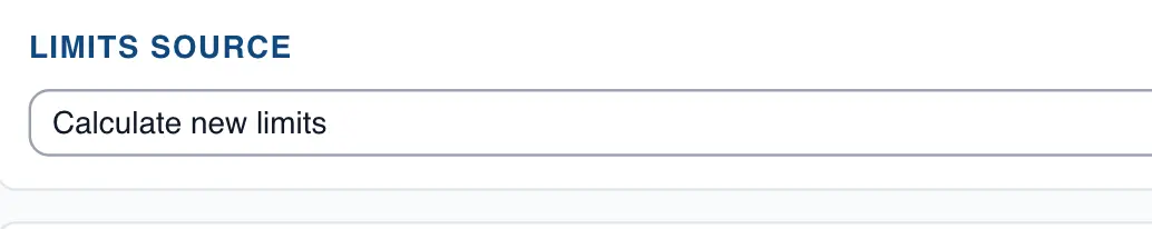
- Click the dropdown and select "Use provided limits"
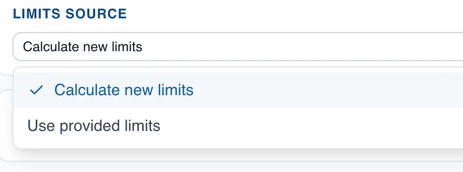
- Enter the process mean and standard deviation.